iPad to print color workflow in 2026
Most iPad print disappointments are not random. They come from three breaks in the chain:
- working in one color space and exporting in another
- reviewing color in shifting lighting conditions
- uploading files without predictable profile handling
Start with destination, not with canvas defaults
Before painting final color, check your print provider requirements:
- accepted file formats
- preferred color space
- PPI target at final size
- whether they publish ICC profiles
Many labs default cleanly with embedded sRGB files. If no explicit requirement is published, sRGB is usually the safest delivery space. [1]
P3 versus sRGB for working artists
- sRGB gives maximum compatibility with fewer surprises
- Display P3 can preserve wider saturation in your master file
- printer gamut and paper still constrain final output
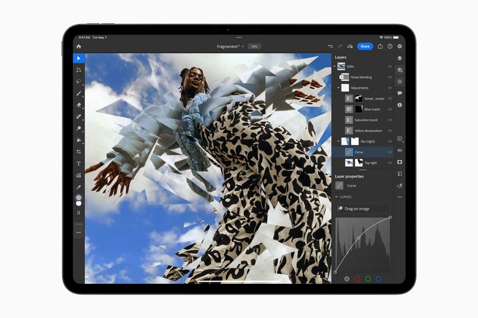
Working in P3 can be useful, but your delivery file still needs profile-aware conversion to the lab target. Apple's color management guidance is clear: converting profiles preserves appearance better than assigning profiles. [2]
iPad review settings that prevent common mistakes
For final color decisions, disable adaptive display shifts:
- True Tone off
- Night Shift off
Both features are excellent for comfort, but they alter perceived white balance and can shift your judgment. [3]
Keep room lighting steady while you review finals. Consistency beats theoretical perfection.
Soft proofing: the step that saves money
If your provider offers ICC profiles, soft proof in a color-managed app before ordering larger prints. This lets you preview clipping and contrast behavior on target paper profiles.
Even if you work primarily on iPad, the workflow principle is the same:
- keep layered master
- soft proof to output profile
- export flattened delivery file in required color space
Export settings that survive real lab pipelines
For most artists and labs:
- format: JPEG maximum quality or TIFF when requested
- color space: embedded sRGB unless lab asks otherwise
- bit depth: 8-bit unless specific workflow requires more
- size: final dimensions at 200 to 300 PPI
If you submit TIFF, verify no alpha channels if the lab disallows them.
Recommended workflow templates
Fast default workflow
- create in sRGB
- review with True Tone and Night Shift off
- export high-quality JPEG with embedded profile
- order small proof print before large run
Wide-gamut master workflow
- create in P3
- keep master editable
- soft proof to output profile
- convert to delivery profile and export flattened file
Troubleshooting by symptom
Print too dark:
- lower review brightness during final pass
- run small proof print
Print too muted:
- check if saturation is clipping in target profile
- verify paper type and profile pairing
Unexpected color shift after upload:
- verify profile is embedded
- verify conversion happened, not assignment only
Bottom line
You do not need a complicated lab pipeline to get consistent prints from iPad work. Decide destination first, keep profile handling explicit, and proof once before volume orders.
The safest default if you just need prints to stop going wrong
If you want the least risky workflow, use this sequence:
- create or export the print file in sRGB unless the lab clearly asks for something else,
- turn off True Tone and Night Shift for the final review pass,
- export with the color profile embedded,
- order one small proof before the larger run,
- correct only one variable at a time after the proof comes back.
That sequence is boring, but boring is exactly what a print workflow should be.
When sRGB is the right answer
sRGB is usually the safest delivery space when:
- the lab does not publish a better target profile,
- you want the least compatibility drama,
- you are delivering JPEGs for standard photo-lab workflows,
- your goal is predictable output, not squeezing every last bit of saturation from the source.
This is why many artists should stop trying to be clever with wide-gamut export paths on the final file. Safe, understood color beats theoretical gamut every time.
When a P3 master still makes sense
Keeping a P3 working file can still be useful if:
- your app supports color-managed export cleanly,
- you want a wider-gamut editable master,
- you are willing to convert deliberately to the delivery profile before upload.
The mistake is not working in P3. The mistake is working in P3 and then exporting carelessly as if the lab will interpret everything the way your screen does.
Symptom-to-fix guide
Prints are too dark
This usually means your screen review was brighter than the print-viewing context.
Try this:
- lower the display brightness during the final review pass,
- proof one small print before ordering the full batch,
- review the proof in neutral lighting instead of warm room light.
Prints are too muted
This often means the print process or paper cannot reproduce what you saw on screen, or the file was exported into the wrong delivery space.
Try this:
- confirm the file has the intended embedded profile,
- confirm the lab expects that profile,
- check whether the paper choice is reducing contrast or saturation more than expected.
Reds, oranges, or neon colors shift badly
This is a common wide-gamut expectation problem. Some colors that look dramatic on an iPad simply cannot come through the same way on the final paper.
Try this:
- soft proof with the actual paper profile if available,
- reduce extreme saturation in the master before export,
- compare the proof to the soft proof, not to a memory of the screen.
The file looks different after upload
This usually points to profile handling, not a mysterious printer failure.
Try this:
- verify the profile was embedded,
- verify conversion happened rather than profile assignment only,
- confirm the service did not strip metadata or force another output transform.
A simple proofing workflow that saves money
When you are unsure, do not jump straight to the expensive final run.
Use this order:
- export one small proof file,
- label the version clearly,
- order the smallest reasonable print,
- compare screen, soft proof, and physical print in steady lighting,
- adjust only one thing before the next proof.
That method is slower than guessing once, but far cheaper than ruining a large order.
Pre-upload checklist
Before sending the file to a lab, verify:
- final dimensions and PPI are correct,
- color profile is embedded,
- file format matches the lab requirement,
- True Tone and Night Shift were off during final review,
- the print has a named proof version if you may need to compare revisions later.
If you cannot answer yes to all five, you are not ready to order at scale.
What not to do
- Do not judge the final print from a screen reviewed in changing room light.
- Do not switch between P3 and sRGB casually during the same workflow.
- Do not upload a file and hope the lab "handles color" for you.
- Do not skip the small proof if the order size or cost actually matters.
This is still a technical workflow, but the right version of it is simple, explicit, and repeatable.
Sources
Recommended gear
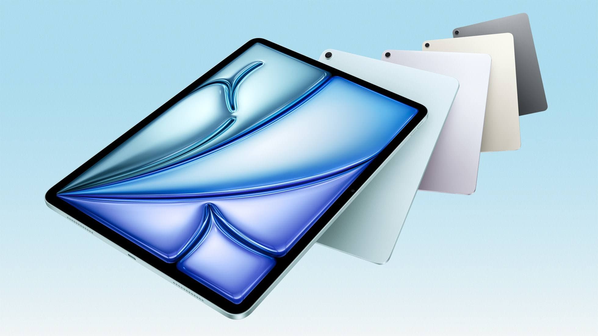
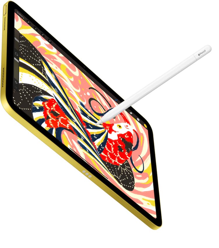
iPad Air (M3)
amazon.comStill a smart Air buy when the discount is real. Harder to justify when pricing drifts too close to the current model.
Pro: Strong prior-gen value when the discount is real
Con: Not the current Air lineup
This is the prior-gen Air. Confirm the discount against the current Air before checkout.
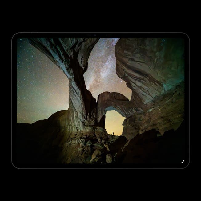
iPad Pro (M5)
amazon.comThe best iPad for drawing feel and premium workflow comfort, but many buyers still overpay for it.
Pro: Best iPad display and ProMotion feel
Con: Highest price in the lineup
Search opens with iPad Pro terms. Check year, chip, and screen size.
Apple Pencil Pro
amazon.comThe best Apple stylus for serious digital art workflows. Expensive, but the control upgrades are real.
Pro: Best brush-control and hover workflow
Con: Highest price in the lineup
Works only with newer iPad models. Check compatibility.
Procreate
apps.apple.comPro: One-time purchase
Con: iPad-only
Clip Studio Paint
apps.apple.comPro: Deep comics, vector, ruler, and animation toolset
Con: iPad plan model is less simple than Procreate
Related buying picks
More in this collectionBuyer guide
Best Bluetooth Shortcut Remotes for Procreate and iPad Drawing (2026)
The right shortcut remote reduces repetitive hand movement, but only if it behaves like a keyboard and supports reliable mapping.
Comparison
Procreate Dreams in 2026: Strengths, Weak Points, Alternatives
A practical 2026 review of Procreate Dreams 2: strengths, weak points, and the best iPad animation alternatives by use case, with workflow tips.
Buyer guide
Best iPad app for tattoo design in 2026
Procreate is the best default iPad app for tattoo design because it is fast for sketching, flash, reference layers, and client revisions; Clip Studio Paint is the upgrade path for rulers, vectors, comics, and studio-style depth.
Comparison
Procreate vs Clip Studio Paint on iPad in 2026
Procreate is the low-friction iPad art app for most beginners and solo illustrators; Clip Studio Paint is better when comics, vectors, rulers, animation, or desktop handoff matter more than simplicity.