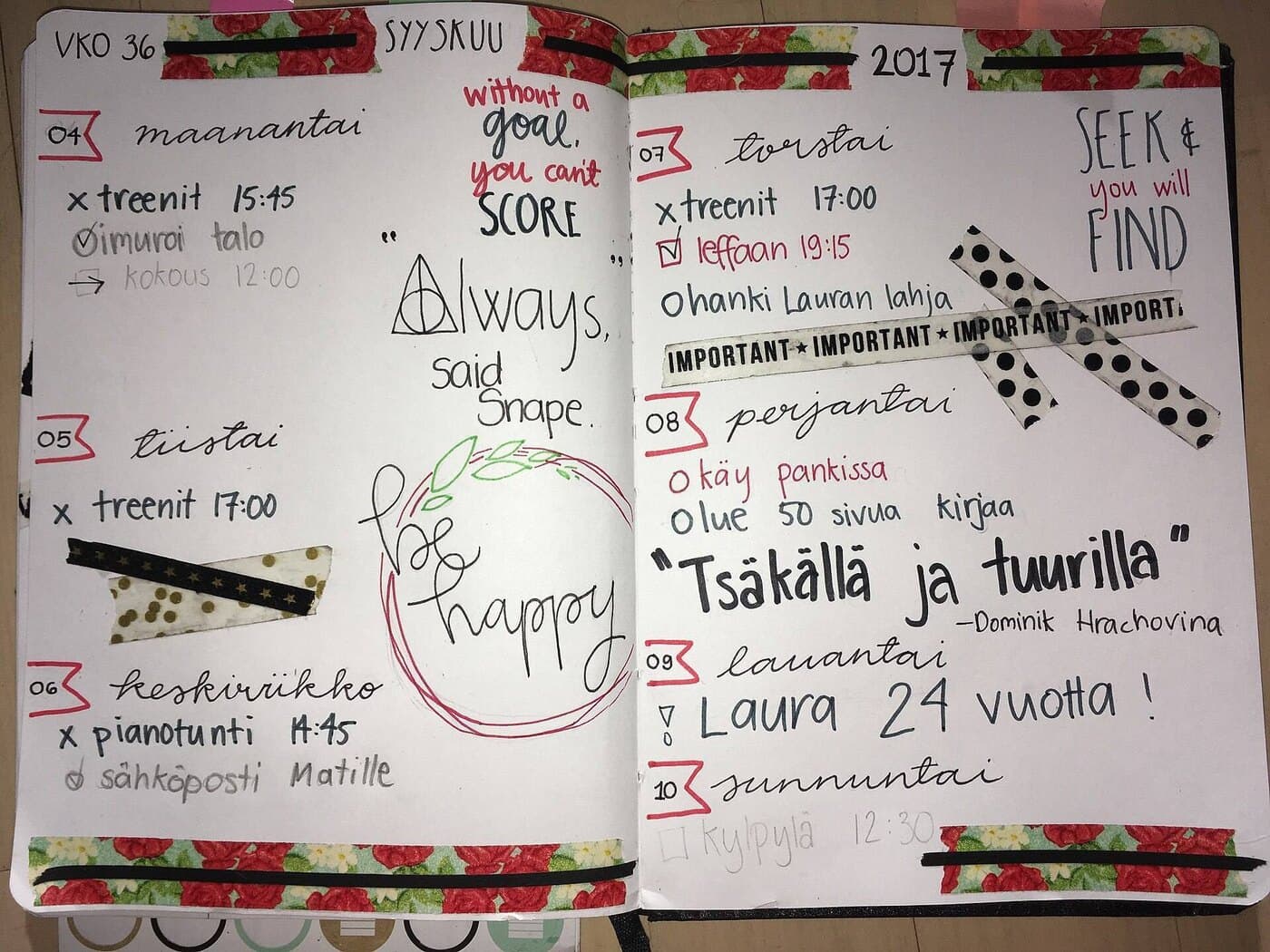
Digital stickers are supposed to make planning feel lighter, more “I got this” and less “why is my Tuesday ugly.” And yet: they’re one of the fastest ways to turn a planner into a tiny, high-resolution panic attack.
Not because stickers are bad. Because stickers are choices. Hundreds of micro-choices, stacked on top of the already absurd number of choices you’ve made today. And when you’re tired, your brain doesn’t fail loudly. It fails quietly: you scroll longer, you tweak spacing, you hunt for the “perfect” icon, and suddenly you’ve spent 35 minutes “planning” without actually deciding anything.
So let’s do this properly: decorate without stress by treating stickers like what they really are, a visual interface for your life, not a craft project you owe to the internet.
The real enemy isn’t mess. It’s decision fatigue.
There’s a reason sticker overwhelm feels… strangely physical. Research on decision fatigue suggests that repeated decision-making can be depleting, and that depletion can impair self-control and subsequent choices. [1]
Now, a fair, adult caveat: pop psychology tends to oversell this. Even “choice overload” (the idea that more options make decisions worse) is not a guaranteed effect; large meta-analyses find the average effect can be small and heavily dependent on context and moderators like task difficulty, complexity, and preference uncertainty. [2]
That nuance matters because it leads to a better rule:
You don’t need fewer stickers. You need fewer sticker-decisions.
That’s the whole game.
What a “digital sticker” actually is (and why that matters)
Most planner stickers are just images, typically PNG files with transparency so they can sit on top of your page without a white box around them. Technically, that “see-through” behavior is usually handled through an alpha channel (a per-pixel transparency layer) in the file format. [3]
In practice, stickers show up in three common forms:
- Individual PNGs (a folder full of separate stickers)
- A “sticker sheet” image (a big page you crop from)
- A sticker book / collection (pre-organized inside your app or in a PDF you import)
The stress level of your planning life depends less on aesthetics, and more on which of these you choose.
The calm approach: build a “two-layer” sticker system
Most people decorate like they’re making a scrapbook page. That’s sweet. It’s also why they’re stressed.
Instead, use two layers:
Layer 1: Functional (the planner should work even if you delete all decoration)
Think labels, headers, checkboxes, subtle highlights, icons that communicate status fast.
Layer 2: Decorative (small, intentional, and never in the way)
Think seasonal touches, mood icons, tiny illustrations, a strip of “washi tape,” a single character sticker.
If you do only this, your planner stays useful even on low-energy days.
Harsh but accurate: if your decorative layer is required for your page to feel “complete,” you’ve made your planner emotionally expensive. And expensive tools don’t get used.
The “No-Stress” rules that keep stickers fun

These rules are boring. That’s why they work.
Rule 1: The 10-second decision cap
If you can’t choose a sticker in 10 seconds, you don’t need it. You’re negotiating with perfectionism.
Rule 2: Three stickers per page (at first)
Not three per box. Not three per section. Three total. This forces hierarchy: the sticker you place must earn its spot.
Rule 3: One palette per week
Pick a palette on Monday. Commit until Sunday. You can break it for emergencies and birthdays, like a civilized person.
Rule 4: Your “default kit” must be tiny
A default kit should feel like a carry-on, not a warehouse:
- 6-10 functional labels
- 6-10 icons (call, meeting, workout, errand, payment, travel, etc.)
- 2-4 decorative accents
When you add more, you’re allowed. But you add it consciously.
Think like a designer: stickers are UI components, not confetti
A good planner spread has the same principles as a good app screen:
Hierarchy
What matters most should be easiest to see. Your biggest visual elements should match your biggest priorities, not your biggest anxieties.
Consistency
If “appointments” are always blue rounded labels and “deep work” is always a black header, your brain stops re-interpreting the page every time.
White space
White space is not “empty.” It’s breathing room for cognition.
This is where most sticker chaos comes from: people fill space because they confuse “blank” with “unfinished.”
Your sticker library is a kitchen. Stop buying ingredients you won’t cook.
Here’s the part nobody wants to hear:
If you have 2,500 stickers and still “can’t find the right one,” you don’t have a sticker collection. You have a sticker landfill.
So set up your library like a kitchen:
1) Keep “everyday” stickers at arm’s length
These are the stickers you’d use even if your tablet battery is at 9%.
2) Archive the “someday” stickers
Seasonal sets, aesthetic themes, fandom packs, great, but not in your face daily.
3) Make your collection searchable by how you think
Not by the seller’s folder names.
Bad category: Neutral Set 04
Good category: Appointments, Food, Admin, Health, Travel, People, Urgent
The app workflows that actually reduce stress (not add to it)
Below is the practical part: how to use each app’s sticker feature so stickers become faster than typing.
Goodnotes: use Elements like a reusable parts bin
Goodnotes’ Elements Tool is built specifically for reusing content, stickers, signatures, stamps, and anything you don’t want to recreate repeatedly. It organizes saved items into Collections (basically folders). [4]
Key stress-savers:
- You can add images as Elements, and Goodnotes supports importing external image files (including .jpg and .png) into Collections. [4]
- You can drag and drop Elements onto the page (instead of doing the “insert image, hunt photo, insert, repeat” ritual). [4]
- On iPad, Goodnotes even suggests using a separate window / Split View for Elements, making drag-and-drop faster. [4]
Photo note: the first gallery image shows the vibe, Elements used as quick, repeatable “everyday stickers.” [5]
Smart way to set it up (once):
- Create 3 Collections:
Daily,Weekly,Decor - Put only your most-used items in
Daily - Everything else goes in
WeeklyorDecor
And if you’re a person who hates picking colors: Goodnotes has pushed “editable stickers” where you can edit text, change colors, and mix layers, useful if you want fewer sticker variants but more flexibility. [6]
Notability: build stickers from your own grouped content
Notability’s approach is elegant: you can select drawn content, Group it, then Save it as a sticker. Your saved sticker appears under My Stickers and can be used in any note. [7]
This matters because it flips the mindset:
Instead of collecting 400 sticker packs, you can make 20 personal stickers that match your life:
- Your exact workout template
- Your own “deep work” header
- Your personal icon language (not someone else’s)
That little Notability step-by-step graphic (gallery image) is basically the whole philosophy: crop/collect once, reuse forever. [8]
Noteshelf: treat Stickers like a quick insert tool (and lock them)
Noteshelf’s support doc is refreshingly direct: To add stickers, open a notebook → tap Add (plus) → Image Gallery → Stickers, then choose one. [9]
And the underrated feature: once a sticker is on the page, you can long-press for options including Resize, Rotate, Copy/Paste, Lock, Bring to front / Send to back. [9]
That “Lock” option is how you stop stickers from becoming fidget toys. Lock your decorative layer so you don’t accidentally drag it while writing.
Photo note: the Noteshelf screenshot in the gallery is a good reminder that sticker insertion should feel like a quick menu choice, not a multi-step import ritual. [10]
The universal method that works in any app: the “Sticker Book” page
Even if your app’s sticker feature is weak, there’s an old trick that never dies:
- Make a sticker book inside your planner file or as a separate notebook
- Put your stickers on pages by category
- Copy/paste (or lasso-copy) from the sticker book into your daily pages
Why it works:
- It reduces searching
- It keeps everything in one place
- It makes your collection feel finite (which is psychologically calming)
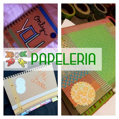
The second gallery (sticker-book style visuals) shows what this looks like in the wild: a compact, navigable set instead of loose files scattered across folders. [11]
A 12-minute weekly setup that prevents 80% of sticker stress
Do this once a week. It’s faster than reorganizing your sticker folders for the fifth time.
Minute 0-2: Pick the week’s palette
Pick 2 neutrals + 1 accent color. Done.
Minute 2-6: Prep your “functional layer”
Drop in:
- Day headers
- Time blocks (if you use them)
- Your top 3 habit trackers (if any)
- One “This Week’s Focus” box
Minute 6-10: Add 3 decorative anchors for the week
Not per day, for the entire week:
- A corner illustration
- A small washi strip
- A tiny mood icon set
Minute 10-12: Make your page frictionless
Duplicate the weekly spread for the next few weeks or set your “starter page” where you always begin.
That’s it. Your daily pages will feel “designed” without requiring daily design labor.
How to place stickers so your page stays readable
Here are the placement habits that separate “cute” from “useful”:
Use stickers to frame content, not bury it
Decorative stickers belong:
- in margins
- in corners
- as section separators
- behind text only if they’re very light and unobtrusive
Keep a consistent scale
If your icons are 12mm today and 30mm tomorrow, your brain reads it as visual noise.
Don’t mix art styles on one page
If half your stickers are minimal line icons and half are full watercolor bears, you’re not “eclectic.” You’re just making your brain translate multiple visual languages at once.
(Unless you’re doing it deliberately. But then you’d already know you’re doing it deliberately.)
Buying stickers without regret: a quick, brutal checklist
Before you download/buy a sticker pack, answer this:
-
Will I use this more than once? If not, it’s decoration, not a tool.
-
Does it match my planner’s visual system? Same line weight, same vibe, same level of detail.
-
Does it reduce typing or thinking? A “Payday” label reduces thinking. A 47-piece illustrated picnic set does not.
-
Is it already organized? “1,000 PNGs in one folder” is not a feature. It’s a trap.
The calm endgame: your planner should feel like home base
The point of stickers isn’t to win at aesthetics. It’s to make your planner feel inviting enough that you actually return to it.
So aim for this outcome:
- On a good day: your planner looks great.
- On a bad day: your planner still works.
- On a chaotic day: you can place one sticker that means “this happened” and move on.
That’s stress-free decoration: a tiny dose of beauty that never blocks action.
Pocket checklist (screenshot this)
- ✅ Two layers: functional first, decorative second
- ✅ 10-second decision cap
- ✅ 3 stickers per page (starting rule)
- ✅ 1 palette per week
- ✅ One tiny “default kit” you can find instantly
- ✅ Lock decorative stickers after placing (when your app supports it) [9]
- ✅ Use Elements / Stickers tools to reuse, not re-import [4]
- ✅ If you’re shopping more than planning, you’re procrastinating, rename it accordingly
Sources
Recommended gear
Goodnotes 6
apps.apple.comPro: Strong templates and organization
Con: Subscription for full features
Apple Pencil (USB-C)
amazon.comA practical low-cost Apple stylus with broad compatibility, but limited for advanced art control.
Pro: Lowest official Apple Pencil cost
Con: No pressure sensitivity for brush work
Compatible with many recent iPads. No pressure support.
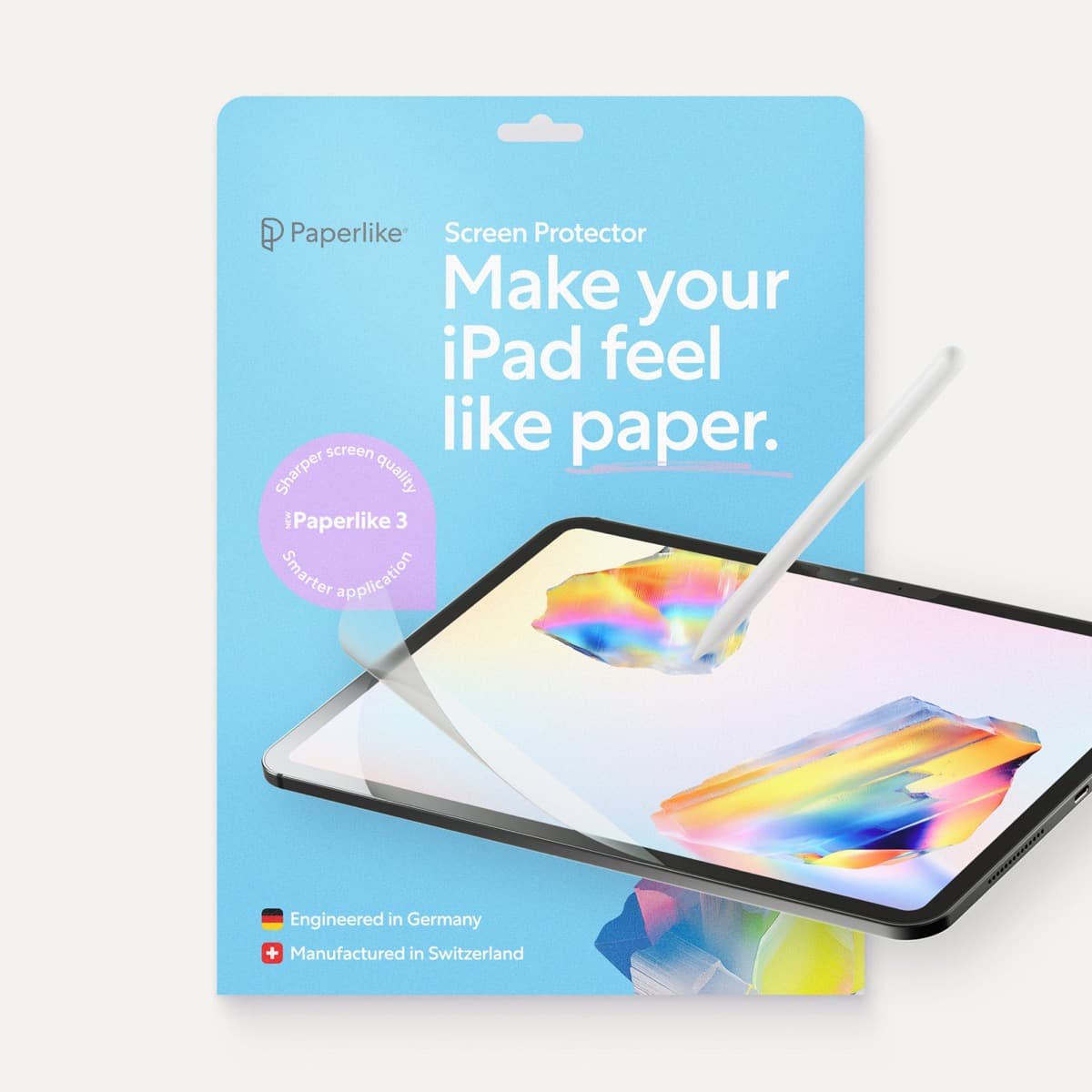
Paperlike 3 (11-inch, 2-pack)
amazon.comA strong surface-feel upgrade for drawing control. Clarity tradeoff is real and should be expected.
Pro: Adds controlled paper-feel friction
Con: Slightly reduces perceived display sharpness
11-inch fit only. Confirm generation before checkout.
iPad (A16, 11th gen)
amazon.comThe best entry iPad for most artists on a budget. It is not premium, but it is very hard to beat on value.
Pro: Best value iPad right now
Con: No ProMotion display
Search opens with the exact model keywords. Verify size and storage before checkout.
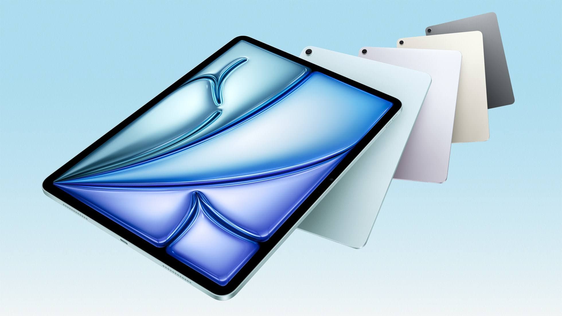
iPad Air (M4)
apple.comThe clean current Air recommendation for most serious hobby artists. Stronger buy logic than old-stock M3 when pricing is close.
Pro: Best current balance of price, headroom, and Pencil support
Con: Still 60Hz
Current Air lineup. Choose size, storage, and keyboard path before checkout.
Related buying picks
More in this collectionBuyer guide
Portable iPad Keyboard Travel Kit (2026): Write, Sketch, Pack Fast
How to build a portable iPad writing and sketch kit for cafes and transit, including keyboard format choices, setup flow, and compatibility checks.
Buyer guide
Travel Charging Setup for iPad Artists (2026): One-Bag Power Kit
A travel charging setup works when charger, power bank, and cables have fixed roles and you run the same simple routine at airports, hotels, and cafes.
Buyer guide
Best Bluetooth Shortcut Remotes for Procreate and iPad Drawing (2026)
The right shortcut remote reduces repetitive hand movement, but only if it behaves like a keyboard and supports reliable mapping.
Buyer guide
Best SD and microSD Card Readers for iPad Creators (2026)
Card reader speed on iPad depends on card bus, reader bus, and iPad port limits. Buy for your actual ingest workflow, not label hype.